Estimating sales uplift is difficult due to the impossibility of simultaneously observing a group of people exist in two different states at the same time.
There are simple strategies that attempt to calculate lift based on the sales difference relative to a historic average, but these simple methods have serious problems. For example, if long term sales are declining the promotion will appear less effective, even if the effect is large enough to detect in aggregate data.
There are better strategies for estimating uplift, this article focuses on the tools4uplift package in R which can aid our understanding of causal effects for binary outcome variables such as whether the customer bought a product, or whether year-over-year sales improved relative to the control group.
This package goes a step beyond average treatment effects and clusters groups of customers based on their propensity to respond to the promotion. This allows us to more precisely distinguish the customers who responded to a promotion from customers who would have bought the item anyway.
Tools4Uplift Package
For those interested in detailed mathematics the package authors have a paper available that goes into some detail. Note that the function names and operational details of the package have changed to make use of S3 classes since this paper was published, but it remains a great reference.
The package utilizes a dual uplift model which is essentially the difference between two logistic regression models.
Outcome of interest Y{(1)} among people who have been treated.
Outcome of interest Y{(1)} among people who are untreated.
The dual uplift models can include interaction terms or not. In addition, the package includes helpful tools for splitting data, quantizing continuous predictors, and evaluating models.
ExampleData
Let’s generate some example data to explore that includes a positive lift for coupon, female gender, loyalty level (1-10), and prior sales.
Once we have our data prepared it would be a good time to quantize any continuous variables prior to creating training and test splits. Tools4Uplift provides functions for splitting variables at points significant for uplift modeling. These will be discussed further below so we will leave things as they are for the time being.
Training and Test Splits
Now that we have some data we can split into training and testing splits. We will use a conventional 70/30 split. The package tools4uplift conveniently balances the splits by treatment and outcome, in this case “Coupon” and “YoYSpend.”
set.seed(1234)
MySplit <- SplitUplift(data = Customers, p = 0.7, group = c("Coupon", "YoYSpend"))

train <- MySplit[[1]]
valid <- MySplit[[2]]
Baseline Model
We will first fit a baseline uplift model containing “PriorSales,” and store the fitted results. The summary outputs two models, one for the control population and another for the treatment population.
Next we will attach our fitted results to our original validation data and create a Performance UpliftTable object which we can use for visuals and validation. Since we have only 300 validation observations we will select five equal groups.
The observed uplift is simply the proportion of treated people with the outcome of interest out of all treated people. Then subtracted from the proportion of untreated people with the outcome of interest out of all untreated people.
The incremental uplift is the difference in treated people with the outcome of interest less untreated people with the outcome of interest. Adjusted based on the ratio or proportion observed instances of treatment to instances of non-treatment. Then divided by the total number of treatments.
More concisely, incremental uplift the net number of outcomes of interest from two equalized groups divided by the total number of treatments.
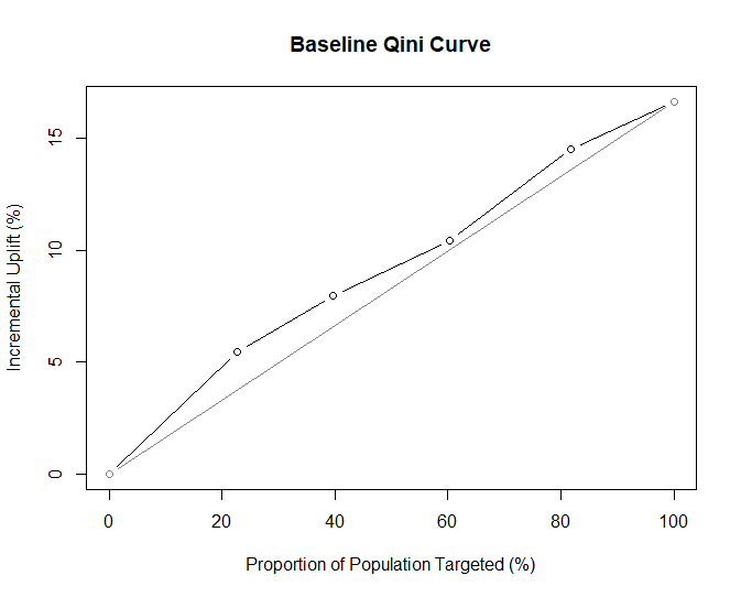
Qini Curve
A Qini curve as described in the authors’ paper is functionally similar to the ROC (Receiver Operating Characteristic) curve commonly used to evaluate classification models. The x-axis is the proportion of the targeted population, and the y-axis represents incremental uplift. There is a diagonal reference line that represents the expectation of randomly guessing uplift given the population proportion.
For example, with 100% of the population we would expect to guess uplift correctly 15% of the time, and that is the same as the incremental uplift for the population. At 20% of the targeted population the model clearly outperforms random guessing but still needs some major improvements to be usable.
Qini Area
Similar to ROC, the area under the curve is helpful in evaluating different uplift models. We can calculate this directly with the convenient QiniArea() function. This integral is also called the Qini coefficient.
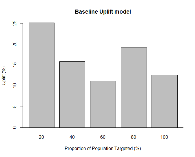
Tools4uplift will also generate a Qini barplot with the barplot() function from tools4uplift. This is simply the observed uplift (%) from the performance table based on the proportion of the population targeted.
Ideally, an uplift model will be able to order observed uplift from highest to lowest which we can see is far from the case below for our validation data.
If the observed uplift appears unordered, as is the case here, it suggests instability in the model. This would mean that the people our model predicted to have the highest uplift (e.g. top 20%) do not actually have the most observed uplift and we should try a different model.
Further below we will see what the Qini barplot looks like in a better model.
barplot(Perf.base, main = "Baseline Uplift model")
Feature Selection
To improve our model we will need to select better features.
The tools4uplift package contains an algorithm for finding the best features with which to predict uplift. This relies on a lasso approach to selecting features that result in the lowest Qini coefficient and in theory the best model.
This is very helpful because given even a modest number of features the number of possible interactions with the treatment variable can grow extremely large and ignoring relevant interactions can cause issues with causal models. To draw a causal conclusion, which is what uplift implies, we need to have a saturated model or a sufficient set of confounders such that we can draw a causal inference from our treatment variable.
Although it is advisable to scale or normalize data before using regularized logistic regression, for the sake of simplicity we will keep our variables as they are.
> features
[1] "Coupon"     "Gender"     "Loyal"      "PriorSales"
attr(,"class")
[1] "BestFeatures
The best features recommended are Gender, Loyal, and PriorSales. Notably, there are no interaction terms suggested. This is not surprising since we did not program any interactions into our test data. However, if that is not the case, there is a related function called interUplift() which will run an uplift model based on interactions that allows us to specify “all” for a saturated model, or “best” for automated Qini feature selection as a parameter.
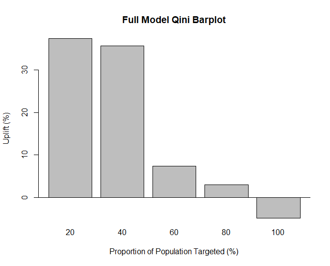
Full Model
Although we would acheive the same result with interUplift() we can also specify the features, ignoring “Coupon,” as predictors in the DualUplift() function for our training dataset.
This model looks significantly better than our first attempt, it manages to correctly order observations based on predicted uplift.
This result illustrates why we would want to model uplift this way. 20% of our population has a large observed uplift, but considering our entire population the observed uplift is negative. In other words, the promotion was effective for some, but not all, customers, and that is critical information for marketers looking to improve their targeting.
As a secondary consideration, it may not be obvious looking at the overall data that the promotion is having a positive impact on subsets of customers resulting in a business throwing the proverbial baby out with the bathwater instead of looking for ways to target more effectively.
The Qini Area is much larger for our full model (4.6) which indicates this model as it fits the validation data better.
Note that the total amount of incremental uplift is unchanged for both models, the key difference is that the second model does a better job at predicting uplift.
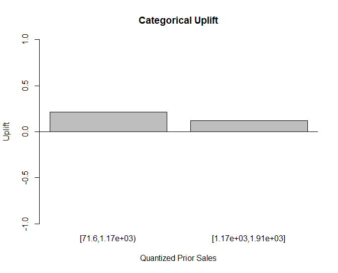
Category Uplift
Suppose we are interested in testing a model with a continuous variable quantized to discrete values. The tools4uplift package makes this process simple with the BinUplift() function, and there is a related function for bi-variate continuous variables (interactions).
This function allows us to select a variable and a level of significance for splitting based on ability to predict uplift.
We can plot out categorical uplift with the UpliftPerCat() function which provides a helpful view of uplift based on the split points of the continuous variable.
[1] "The variable PriorSales has been cut at:"
[1] 1167.413
Once variables are descretized the process is identical to the above examples except that we discard the prior continuous variables. To spice things up we will use a saturated interaction model with InterUplift() by specifying input = “all” along with the new categorical variable we have created.
Although the saturated model with all terms and interactions does respectable, the best model is the one recommended by BestFeatures(), this makes sense since we did not program any interactions into our example dataset.
Conclusion
Uplift is difficult to measure even with randomized groups, and basic business methods are unfortunately not well suited to causal inference even for simple problems. Moreover, typical measures such as average treatment effects, although an improvement, lack nuance to distinguish between the impact of the treatment on particular individuals.
The tools4uplift package is a great way to quickly explore different uplift models, identify important features, and more importantly identify customer groups who benefit from promotion, and customers who do not.
References
Brumback, B. Fundamentals of Causal Inference with R; CRC / Chapman Hall, 2022.