We rely on forecasts when we plan for the future. Although life has a random component, there is a surprising amount of stability. For example, if we normally see 10,000 customers per day, and suddenly no-one comes through the door we would be shocked and searching for an explanation. This stability allows us to make predictions, at least under similar assumptions.
Let’s explore using a Seasonal ARIMA model to forecast some random sales data we found on Kaggle with the hope of applying it to our hypothetical bottom-up forecast.
ARIMA Forecasting
There are many different forecasting methods, which one to use will often be determined by the data, but we will focus on the well known ARIMA model which has three components:
Auto Regressive – This means what happens tomorrow depends on what happened today.
Integrated – We difference our data, or basically remove positive/negative trend.
Moving Average – Taking the average over a rolling window of time
ARIMA can also incorporate external regressors, these are side inputs like price and temperature, or other data points containing information that can help improve prediction accuracy.
Data Required
We need unit volume data plus some extra exploratory factors at regular intervals, in this example we will use daily data and temperature.
Results
We create a validated forecast that suggests Product 3 will sell approximately 1,100 units on the 25th day beyond where our data ends. Follow along below to see how we arrived at this result.
“Products P3 and P4 are daily and might be related. For product P4, the company has provided potential explanatory variables X1 (price) and X2 (weather forecast of temperature in °C) that may be helpful for forecasting these two products. The sales data for products P3 and P4 was collected until November 24, 2019.”
Having downloaded the dataset we load it using the read.csv function and run a summary to check for missing values which can cause havoc with time series. Fortunately, none exist so there is no need to consider an imputation strategy (replacing missing values with sensible guesses).
Correlations
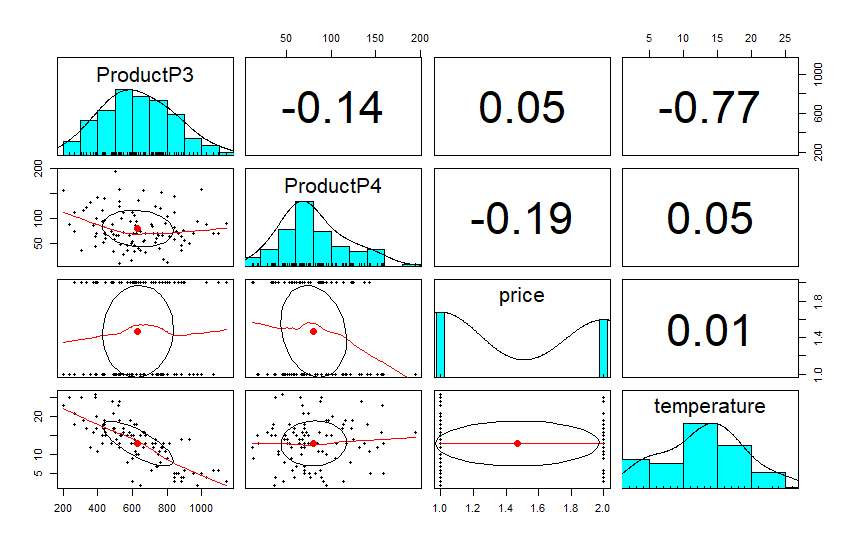
The pairs.panels function in the psych package helps us visualize the correlations between Product3, Product4, and our extra factors (called xregs for external regressors).
This plot tells us that P3 has a very strong negative relationship to temperature and a moderate negative relationship to sales of P4. Possibly these are partial substitutes, and to some extent P4 is preferred when temperature is higher.
P4 has a moderate correlation to price levels (in this example price is a binary variable), while P3 has very little relationship to price and appears to be driven by temperature, which may itself be a proxy for season.
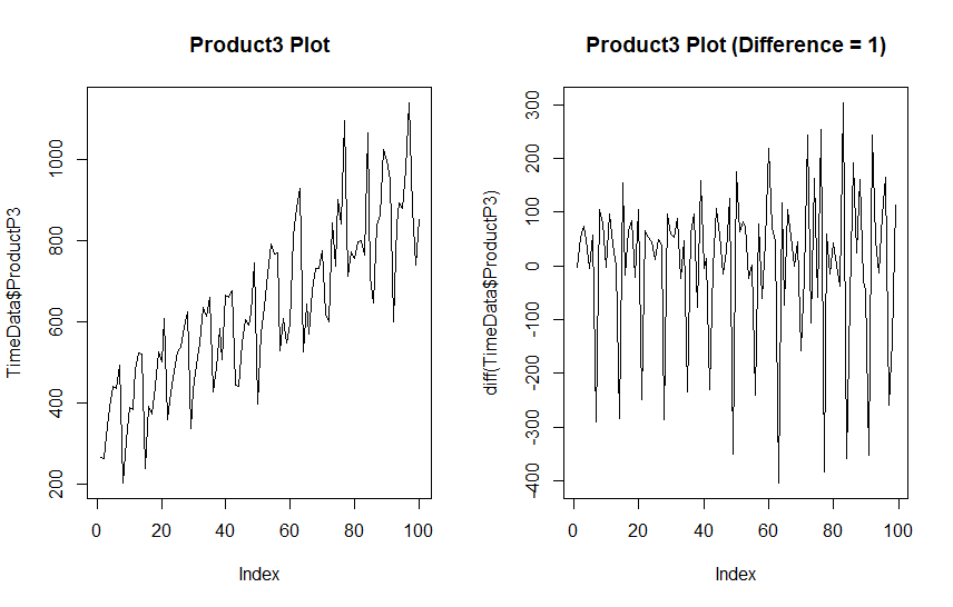
Let’s plot out Product3 as it appears plus a version that has been differenced to remove the trend. Normally one differencing operation will remove the trend and we do not want to over-difference. We will also run a KPSS test (Kwiatkowski–Phillips–Schmidt–Shin), and ADF (Augmented Dicky-Fuller) test to determine if our data is stationary.
par(mfrow = c(1, 2))
plot(TimeData$ProductP3, type = "line", main = "Product3 Plot")
plot(diff(TimeData$ProductP3), type = "line", main = "Product3 Plot (Difference = 1)")

kpss.test(TimeData$ProductP3)

adf.test(TimeData$ProductP3)
	KPSS Test for Level Stationarity

data:  TimeData$ProductP3
KPSS Level = 1.9701, Truncation lag parameter = 4, p-value = 0.01

	Augmented Dickey-Fuller Test

data:  TimeData$ProductP3
Dickey-Fuller = -8.4768, Lag order = 4, p-value = 0.01
alternative hypothesis: stationary
The KPSS rejects the hypothesis that our data is stationary, and there is an obvious increasing trend. The ADF test however suggests this data is stationary. This specific result suggests a difference stationary time series, that is a series that can be made stationary with differencing.
Differencing
Differencing is simply subtracting each observation by the one that comes after it, which is called a lag. This will remove the trend in many cases.
Taking a single difference seems to have ejected the trend from our data although some seasonal component looks to remain (the long downward spikes).
A stationary time series means that the average and variation in the series both equal zero, in other words, there is no pattern just random noise. That part of the time series contains no useful information and is impossible to predict.
We are interested in is finding out what is trend, and what is seasonal, because that contains information we can use for predictions. If our data had no trend or seasonal differences it would be pretty boring, we could just forecast future values based on average units with a tad of random variation.
Weekly Variation
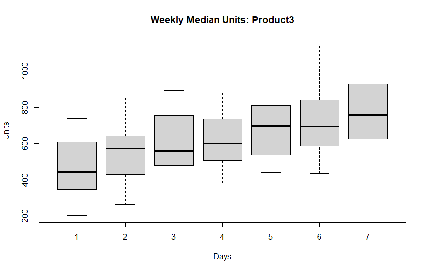
Daily sales data tends to have weekly seasonality because humans revolve around weeks. We can check for weekly seasonality by creating boxplots aggregating on day-of-week.
p3.days <- data.frame(Units = TimeData$ProductP3, Days = c(rep(1:7, 14),1:2))
par(mfrow = c(1,1))
boxplot(Units ~ Days, p3.days, main = "Weekly Median Units: Product3")
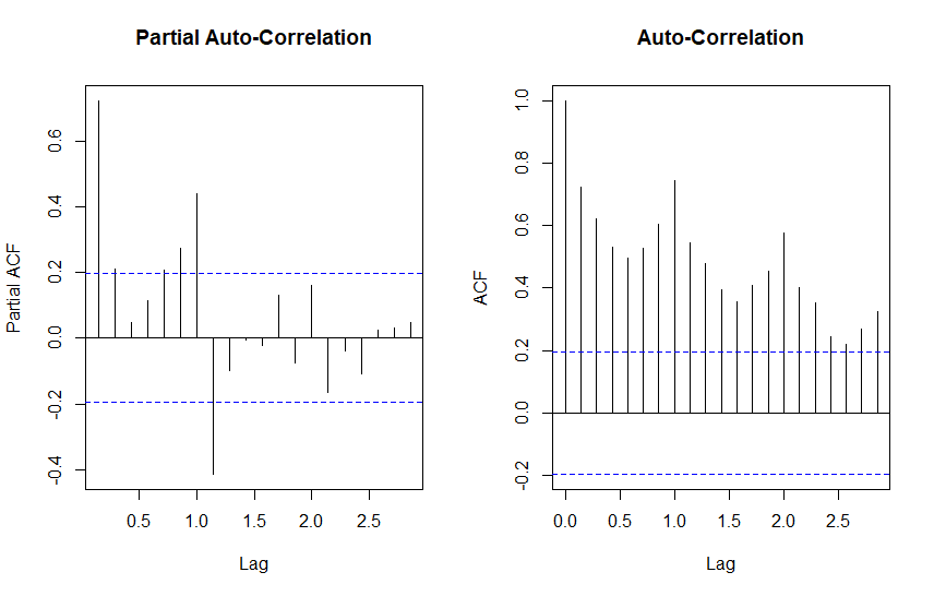
Product 3 has an obvious pattern that seems to increase from day 1 through day 7. This suggests using a weekly frequency in our time series object. Let’s create a weekly time series from our data, and also plot out partial auto-correlation (PACF) and auto-correlation (ACF).
ts.p3 <- ts(TimeData$ProductP3, frequency = 7)

par(mfrow=c(1,2))
pacf(ts.p3, main = "Partial Auto-Correlation")
acf(ts.p3, main = "Auto-Correlation")
Auto-Correlation tells us that tomorrow depends on today. While Partial Auto-Correlation tells about relationships between points of time that are indirect, and possibly seasonal. Points outside the blue dashed line indicate presence of either, respectively.
Significant PACF tends to suggest moving average (MA) components, and ACF tends to suggest autoregressive (AR) components.
These charts tell us about the information in our series, there is obvious trend and what appears to be some seasonality. Let’s see what these plots look like for differenced data.
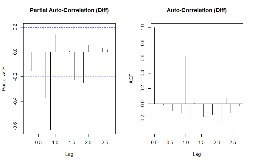
par(mfrow=c(1,2))
pacf(diff(ts.p3), main = "Partial Auto-Correlation")
acf(diff(ts.p3), main = "Auto-Correlation")
The differenced ACF plot has clamed down somewhat, but still shows significant autocorrelation at lags 1 and 2. PACF is similar, but mirror imaged.
All together we are looking at an ARIMA model with both moving average and autoregressive components and some first order differencing.
Auto-Arima
The auto.arima function in the forecast package is a great way to get a quick-and-dirty forecast for data that lends itself well to this type of model. This can be very helpful if we need to automate forecasting and we are not looking for laser precision.
We are going to use auto.arima for a starting point and try use what we understand about this time series to improve on the model.
First we will add Product 4 and Temperature into the model because those factors had the highest correlation with Product 3. Next in order to to avoid an awkward jump we will reverse the temperature data to simulate a more plausible flow of temperature over the next 100 days. (In a real situation we would look to historic weather data for help predicting future time periods.)
We will also assume for the forecast that we expect P4 to experience a reversal in seasonal demand starting from period 100.
We won’t complicate things with price for the time being as it has a small relationship with volume and we were not given actual prices anyway.
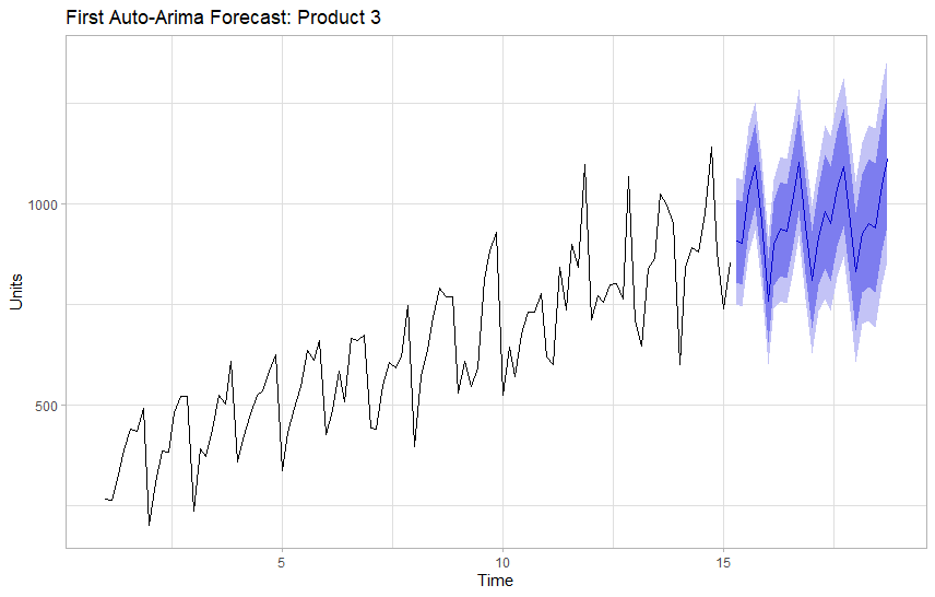
We will focus on a forecasting horizon (h) of 25 days including the correlated factors as external regressors.
Series: ts.p3
Regression with ARIMA(0,1,1)(2,0,0)[7] errors

Coefficients:
          ma1    sar1    sar2     Temp       P4
      -0.9205  0.4324  0.4183  -4.3512  -0.1915
s.e.   0.0361  0.0886  0.0942   2.1909   0.2408

sigma^2 = 6420:  log likelihood = -576.52
AIC=1165.05   AICc=1165.96   BIC=1180.62

Training set error measures:
                   ME    RMSE      MAE      MPE     MAPE      MASE      ACF1
Training set 14.25084 77.6867 60.12591 1.425085 9.449312 0.7548204 0.0977102
The first run looks decent, auto-arima suggests that we use a differenced moving average model (0,1,1), with a second order auto-regressive seasonal component (2,0,0).
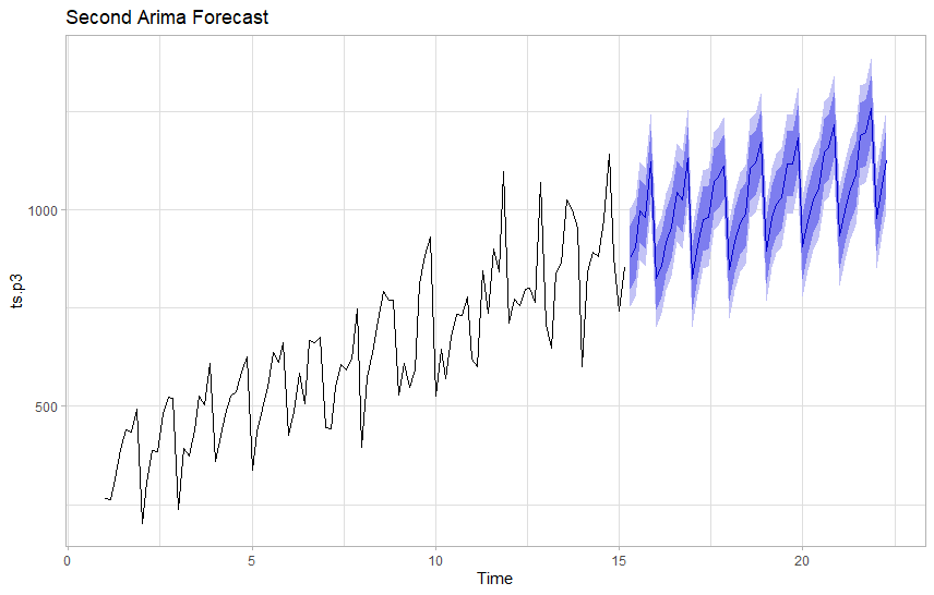
Next we want to see if we can get a better AICc score with the Arima function using this as a starting point.
Series: ts.p3
Regression with ARIMA(0,1,1)(2,1,1)[7] errors

Coefficients:
          ma1     sar1     sar2     sma1     Temp       P4
      -1.0000  -0.1971  -0.1878  -1.0000  -3.9366  -0.0635
s.e.   0.0609   0.1169   0.1185   0.1164   2.1276   0.2356

sigma^2 = 3606:  log likelihood = -519.88
AIC=1053.76   AICc=1055.09   BIC=1071.41

Training set error measures:
                   ME     RMSE      MAE        MPE     MAPE      MASE       ACF1
Training set 2.730741 55.68981 38.67992 -0.2761448 5.854694 0.4855875 0.03229725
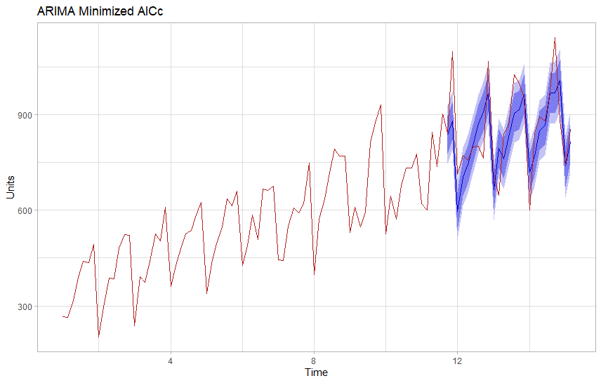
Adding seasonal differencing and a seasonal moving average component improved our AICc score by 100 points and also provides a more plausible looking forecast with a narrow confidence band. We expect 90% of observations to be within the light blue area, so wide areas suggest a model that lacks certainty.
This model suggests about 1,100 units on the final day of our forecast period 25 days out.
Validation
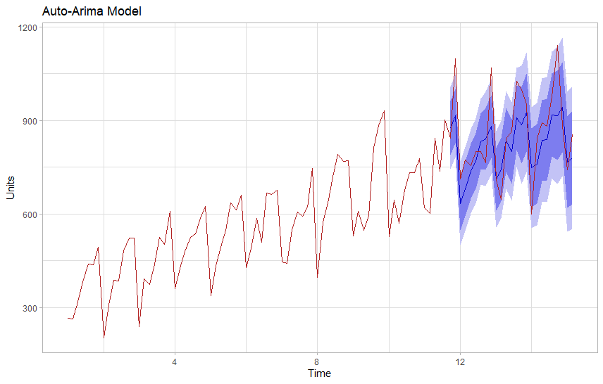
In order to validate our forecast we will train both our models on 75 points of data and try to predict 25 points that we know values for. We will exclude those from training, hiding them from our model to test how it performs on unseen data.
Visually the modified ARIMA model appears to offer a tighter forecast that is generally more accurate. We can also evaluate this numerically by comparing our test to the actuals.
Val <- cbind(
      Actuals = ts.p3[76:100],
      Auto = fcst$mean,
      MinAIC = fcst2$mean)
Val

accuracy(Val[1], Val[2]) ## Auto Arima
accuracy(Val[1], Val[3]) ## Regular Arima
Time Series:
Start = c(11, 6)
End = c(15, 2)
Frequency = 7
         Actuals     Auto    MinAIC
11.71429     843 875.7050  836.1755
11.85714    1097 914.8651  880.5783
12.00000     713 634.1601  596.2297
12.14286     772 679.9473  704.0582
12.28571     756 737.5822  744.0164
12.42857     799 769.5617  803.8687
12.57143     801 831.6470  870.5536
12.71429     764 840.7720  909.0440
12.85714    1068 880.2759  965.1837
13.00000     709 710.7556  664.0425
<...>

> accuracy(Val[1], Val[2]) ## Auto Arima
          ME RMSE MAE      MPE     MAPE
Test set 254  254 254 23.15406 23.15406

> accuracy(Val[1], Val[3]) ## Regular Arima
           ME RMSE MAE       MPE     MAPE
Test set -130  130 130 -18.23282 18.23282
As expected the modified Arima model has better scores on our testing set. RMSE (Root Mean Square Error) allows us to compare two similar models, and we would prefer the model with the lower score.
Conclusion
Forecasting is as much an art as a science. Depending on the precision required we might try some different approaches to minimize our errors. If a forecast looks good enough we have to weigh additional time against the diminishing returns of extra work.
For this particular data, unless we can predict temperature we may not have a reasonable expectation of improving real world accuracy 25 periods out, but we could easily re-run our model every week to re-adjust it based on short term forecasts.
In any case, we can often tell a lot about the future by looking to the past and having good sales estimates is helpful in planning and budgeting. Especially in an inflationary economy where rising prices are likely to play a large role in future demand.
Links
Be sure to check out Forecasting Principles and Practice by Rob Hyndman if you are interested in learning more about forecasting techniques. It’s a great book to get started with, and the online version is free.
References
Hyndman, R. Forecasting Principles and Practice, 3rd Ed., OTexts, 2021.
Chatfield, C.; Haipeng, X. The Analysis of Time Series: An Introduction with R.7th ed. Chapman Hall/CRC, 2019.