Histograms are one of the most basic but powerful tools in data science, they reveal the relative frequency or probability of an event happening. Often times we want to know how likely an event is so we can estimate the expected value or adjust a program so that it is more likely to square up with a particular audience.
Excel contains a “hidden” toolkit for creating histograms and performing other fundamental data tasks. This is called the “Analysis ToolPak.”
Installing Data Analysis ToolPak
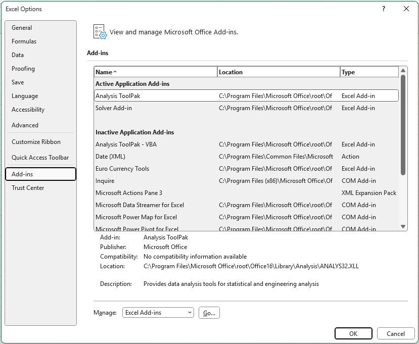
To install the extension open the options, and in “Add ins” click the “Go…” button at the bottom.
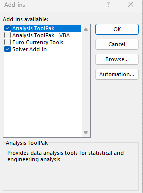
Check the box for Analysis ToolPak, and while you are at it the Solver Add-in can be handy for solving optimization problems.
The Big Fish (Taco)
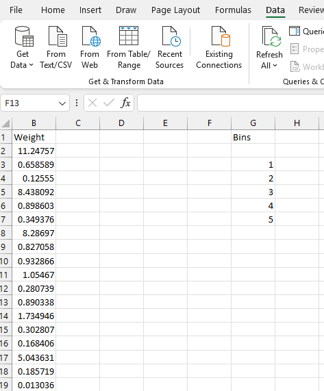
In this example we have some data representing the weight of fish included in a customer’s taco order. The customer can order fish by weight, and we want to understand the odds of seeing a large order to better plan our stock levels.
Binning Data
For this simple example, we’re interested in the frequency of fish weights that fall below 1, between 1 and 2, and between 2 and 3, and so on. So we have created a column of bin numbers to represent that. Note that bins are up to but not including the larger number in Excel.
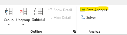
To run a histogram select the data menu in the ribbon and you will find your new Data Analysis tools in the top right. Click on “Data Analysis” and then choose “Histogram.”
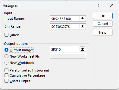
Setup Dialog
In the dialog we need to select all the fish weights in column B as the input range, and then the bin range as Bin Range. Also select a cell or new worksheet to output the frequency data into.
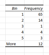
Once the operation is completed Excel generates a frequency table for us that we can use to create a standard bar plot.
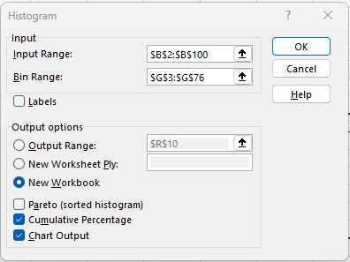
A slightly different spin on this technique is to create a cumulative histogram and ask Excel to create the chart for us.
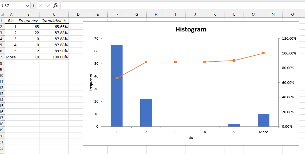
This options provides Cumulative percents for each bin. Here they suggest that given many customers we would expect about 35% of them to purchase more than 1 pound of fish for their tacos, and 88% of our customers will purchase 2 pounds or less.
Conclusion
The histogram function in the data analysis tookpak is a non-stanard excel feature that comes in handy when we need to break continuous data into discrete frequencies for planning or estimation.