Visualizing two dimensional data gets difficult very quickly as the number of categories grow. This creates a problem since most types of customer segmentation will include four groups of customers.
Trying to understand segment behaviour across six product categories would create an incomprehensible mess as a clustered column chart.
This is where radar charts, also called spider diagrams, can come in handy. They offer a great way to communicate behaviour profiles or demographics to your audience.
Below we will summarize our long-form data and prepare two radar charts.
Preparing Data
In order to pull off a Radar chart we need a summary cross tabulation table that contains three things:
Row names for the categories we are interested in.
Column names for the attributes.
A numeric measure
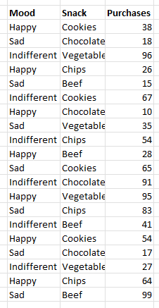
For example, we may wish to look at the number of purchases in product categories based on customer mood.
In Excel the two simplest options for cross tabulating long form data are using a pivot table or transforming it in Power Query.
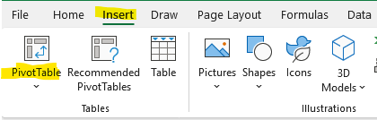
Select all the long form data and then “PivotTable” from the Insert menu.
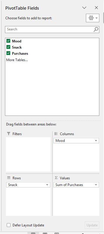
Setting up the Pivot Table is simple. We put the mood field on columns and the snack field on rows.
For values we place our purchases measure. In this example we are using a sum, if we require an average this can be changed in the values sub-menu.
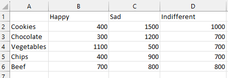
Next we can copy the data we need from our summary pivot table but right clicking and choosing “paste special – values” from the menu.
Creating a Radar Chart
Once we have our data in the required format, Excel makes it simple to turn this into a radar chart. For this example, we will use the data below.
Simply select the entire data table and from the “insert” menu choose the Radar Chart you like.
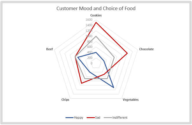
Chart Interpretation
We have changed the colouring and bolded the categories to make them stand out.
This format makes it very easy to see that Sad customers are more into cookies and chocolate than vegetables.
From the chart it appears that we would have an easier time selling vegetables to happy customers.
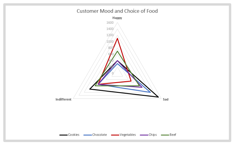
Switching Rows and Columns
We can also switch the rows and columns easily under the “Chart Design” menu. It’s a good idea to quickly check which layout does the best job communicating your message.
Conclusion
Radar charts are an often overlooked method of communicating categorical data and cross tabulations to your audience. If your clustered column charts are giving you a headache give one of these a try and see if it helps create a more compelling story.