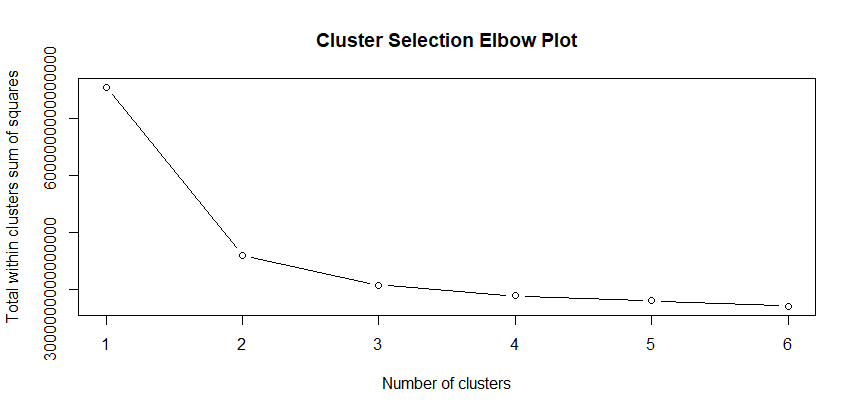
Customer Segmentation k-Prototypes

Business Insights

Customer segments help us  craft efficient marketing strategies, making the best use of organizational resources. Segmentation can inform high level strategic decisions, or it can be used in an operational context to target customers most likely to be swayed by our messaging.

At scale it is difficult to get to know every customer personally much less meet their needs, so relying on generalizations helps us please more people more of the time. Modern organizations rely on clustering algorithms to simplify the process customer groupings while steering clear of subjectivity and internal bias.

Let’s explore how to use R to identify segments that will help us pitch new insurance products to existing customers.

Dataset

We will use some insurance industry data available at Kaggle: https://www.kaggle.com/datasets/ravalsmit/customer-segmentation-data

The data contains demographic information, and basic sales data such as policy type, last purchase, and premium amount. Presumably these are expats living in India given that their preferred languages do not match the geography.

This is a well-balanced dataset across all features, clearly someone did a great job pulling a representative sample for us to work with.

Results

We separate our customers into two high loyalty groups. One of consisting of professionals, and another of salaried employees; these groups have different identifiable policy needs. This will form the basis of our regional campaign strategy.

Follow along below in R Studio to see how we arrived at this result.

Loading the Data

Having saved the Kaggle dataset as “SegData.csv” let’s read that into R and run a summary to get familiar with our dataset. We use stringsAsFactors to factorize the text variables.

options(scipen = 999)

library(tidyverse)
library(RColorBrewer)

SegData <- read.csv("SegData.csv", stringsAsFactors = T)
summary(SegData)

Data Cleaning

This data is a complete mess so we will need to make it more manageable in terms of variable names and the number of features.

We do some basic data work such as downsizing Marital Status to Married or Single and turning last purchase into a recency of days. We also turn Education into an ordered three level factor.

Importantly, we are going to group the occupations into three categories for self-employed, salaried employees, and professionals. The assumption here is that those groups have distinct insurance needs and we will want to cluster on this.

Feature Engineering

We also do a bit of feature engineering that will be helpful later. We will assume the amount of coverage divided by premium gives us an idea of purchase frequency. Leverage is income divided by premium, this tells us how much income is already tied up in premiums.

## Clean up SegData

ClusterData <- dplyr::select(SegData,
                             Customer.ID, Age, Gender, Marital.Status, Education.Level, Occupation, Income.Level,
                             Purchase.History, Preferred.Communication.Channel, Preferred.Language, Policy.Type,
                             Insurance.Products.Owned, Coverage.Amount, Premium.Amount, Geographic.Information
)

colnames(ClusterData) <- c("ID", "Age", "Gender", "Marital", "Edu", "Job","Income", "LastPurchase", "ComPref", "Lang",
                           "Policy", "Owned", "Cover", "Prem", "Geo")

ClusterData$LastPurchase <- mdy(ClusterData$LastPurchase)
ClusterData$LastPurchase <- as.numeric(difftime(ymd("2023-12-28"), ClusterData$LastPurchase, units = "days"))

ClusterData <- mutate(ClusterData, 
                      ComPref = factor(ComPref, levels = c("Mail", "Email", "Text", "Phone", "In-Person Meeting"),
                                       ordered = T),
                      Marital = factor(case_when(
                        Marital %in% c("Divorced", "Seperated", "Widowed", "Single") ~ "Single",
                        T ~ "Married")
                      ),
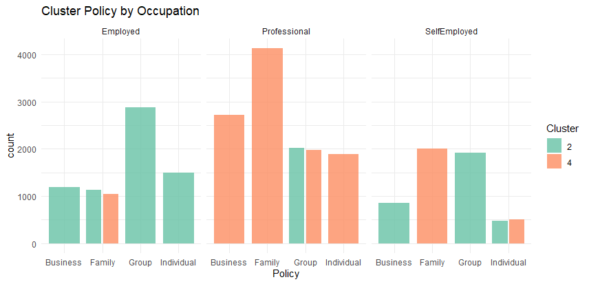
                      Job = factor(case_when(
                        Job %in% c("Doctor", "Lawyer", "Teacher", "Engineer") ~ "Professional",
                        Job %in% c("Manager", "Salesperson", "Nurse") ~ "Employed",
                        Job %in% c("Artist", "Entrepreneur") ~ "SelfEmployed",
                        T ~ Job
                      )),
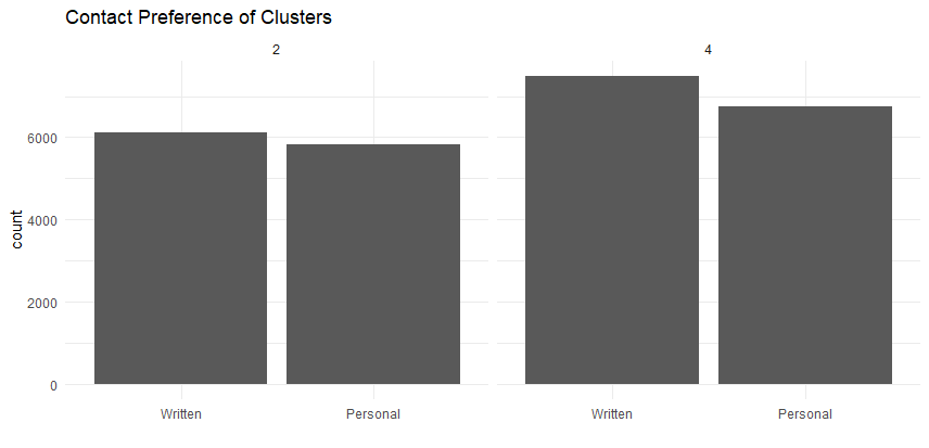
                      ComPref = factor(case_when(
                        ComPref %in% c("Mail", "Email", "Text") ~ "Written",
                        ComPref %in% c("Phone", "In-Person Meeting") ~ "Personal"
                      )),
                      Edu = factor(case_when(
                        Edu %in% c("Associate Degree", "Bachelor's Degree") ~ "College",
                        Edu %in% c("Master's Degree", "Doctorate") ~ "Grad",
                        T ~ "None"
                      ), levels = c("None", "College", "Grad"), ordered = T),
                      Freq = round(Cover/Prem),
                      Lever = round(Income/Prem),
                      Age = cut(Age, quantile(Age), labels = F, include.lowest=T),
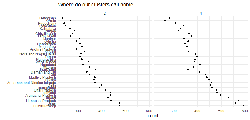
                      Geo = factor(Geo)
)

RFM Loyalty

The next phase is creating an RFM metric (Recency, Frequency, Monetary). This is a common behaviour based heuristic used to segment customers by loyalty.

Customers will be both loyal and valuable if they shop often, spend a lot, and have been seen recently. RFM is preferred to average spend is because it recognizes that frequent customers have high long term value even if they spend smaller amounts.

Below we use R’s Cut function with “labels = False” to turn our metrics into a four point scale for Recency based on last visit, Frequency (Q) as defined above, and Monetary defined as total coverage owned (with the assumption that actuaries will assign appropriate premiums given volume of coverage).

Since low recency is a positive trait we also flip the scale by subtracting the maximum, taking the absolute value, and then adding back the minimum. This causes 4 to indicate a good recency score.

Finally, since we do not want to try oversell to customers with high premium to income ratios we will include Leverage as a penalization variable that works against RFM. Our ideal customer is has high RFM and is spending proportionally less of their available income on insurance.

ClusterData <- mutate(ClusterData,
                      R = cut(LastPurchase, quantile(ClusterData$LastPurchase), labels = F, include.lowest=T),
                      Q = cut(Freq, quantile(ClusterData$Freq), labels = F, include.lowest=T),
                      M = cut(Cover, quantile(ClusterData$Cover), labels = F, include.lowest=T),
                      L = cut(Lever, quantile(ClusterData$Lever), labels = F, include.lowest = T)
) %>% mutate(
  R = abs(R - 4) + 1, ## Reverse Scale (abs(#-Max)+Min)
) %>% mutate(RFML = R+Q+M+L, RFML = cut(RFML, quantile(RFML), labels=F, include.lowest=T))

K-Prototypes

K-Means is one of the most popular clustering algorithms but it can not handle categorical data. K-Modes is a variation that can handle categorical data, but has the opposite problem of not being able to handle continuous data. Since our data is mixed K-Prototypes is a good compromise solution from the clustMixType package.

Before we jump into clustering we need to determine which of the enormous number of features is relevant for grouping, and what features may be relevant for targeting after we decide on our groups.

After some experimentation, we settled on the RFML score as it tells us whether the customer is likely to buy more insurance from us. Occupation, because we can expect that different occupations will have different insurance needs, and Policy as that tells us what type of policy the customer currently owns.

Selecting the Number of Clusters

We will  next create an Elbow Plot to assist us in determining the optimal number of clustered based on the “within sum of squares” distance.

The optimal number of clusters will be within 3 and 5 for most business uses. This is partly because of diminishing returns with larger numbers of clusters, and partly because human salespeople find it difficult to think about more than five clusters. On the other hand, two clusters is normally not specific enough for targeting so we like to have at least three clusters.

In practice, four clusters tends to provide a good balance between complexity and specificity, unless there is a genuine need for a different number of clusters.

library(clustMixType)

wss <- sapply(1:6, function(k){kproto(ClusterData, k)$tot.withinss})
plot(1:6, wss,
     type="b",
     xlab="Number of clusters",
     ylab="Total within clusters sum of squares",
     main = "Cluster Selection Elbow Plot")

The idea behind an elbow plot is that we would want to pick the number of K clusters at the point where the graph turns (the elbow) since beyond there we get diminishing returns. This plot suggests that 2 or maybe 3 clusters would be optimal.

Actually Choosing Clusters

Although everyone loves unsupervised learning, it would be a mistake to let software decide for our business what the appropriate number of clusters is. There should some back and forth between the business, and some trial and error with a focus on what the goal is.

Segmentation is useful if it advances the objectives of the business, not because k-prototypes tells us that it clustered some things together. It will always return clusters, whether they are useful or not.

We are not asking a higher power to divine our business strategy for us. We are using a technology to efficiently group things together. Basically emulating what would happen if we put ten marketing people in a room and asked them to come out with 4 clusters, except with less arguing.

The important point is that we should choose clusters that support the business, and we should avoid letting software dictate how our business should be run.

Exploring our Clusters

In this case the elbow plot gave a good recommendation on clusters, at least from a mathematical perspective, but we are going to ignore it.

We tested a few scenarios and three clusters was awkward, but two was not specific enough to assist our marketing team with targeting. So we are going to create four clusters understanding that two will be thrown away.

set.seed(123)
Proto.Sample <- ClusterData[,c(6,11,21)]
kp <- kproto(Proto.Sample, k = 4, nstart = 25)

MyClust <- cbind(Cluster = kp$cluster, ClusterData)

Another approach would have been to select additional variables to segment on, and these could increase the number of clusters. We won’t do that here as our marketing department is on a permanent holiday, and two high value clusters seems adequate for campaign targeting.

Making clusters just for the sake of having more clusters just creates unnecessary confusion. Given that our objective is targeting, we will look at the demographic makeup after the fact, rather than cluster on it initially.

Summarizing Clusters

Once we have clusters one method that can be helpful is to create a summary table of average values so we can see which segments rate higher on which qualities. This works for continuous variables, and it can work for factors. We have turned Gender into an integer so that the average will be between 1 and 2, with higher values indicating more men in the cluster.

Clust.Pivot <- group_by(MyClust, Cluster) %>%
  summarize(Age = mean(Age), 
            Gender=mean(as.integer(Gender)),
            Marital=mean(as.integer(Marital)),
            RFML = mean(RFML),
            Edu = mean(as.integer(Edu)),
            Lever = mean(Lever),
            Freq = mean(Freq),
            Prem = mean(Prem),
            R = mean(R),
            Q = mean(Q),
            M = mean(M),
            Income = mean(Income)
  )

Clust.Pivot

We are most interested in cluster 2 and cluster 4 because those have the highest RFML scores. They also have the most capacity (Lever) in their income for new products. Their premiums are also quite low, and of course we would like to change that.

# A tibble: 4 × 13
  Cluster   Age Gender Marital  RFML   Edu Lever  Freq  Prem     R     Q     M  Income
    <int> <dbl>  <dbl>   <dbl> <dbl> <dbl> <dbl> <dbl> <dbl> <dbl> <dbl> <dbl>   <dbl>
1       1  2.43   1.51    1.59  1.74  2.20  14.6  141. 3811.  2.50  2.12  2.51  54544.
2       2  2.45   1.53    1.59  3.00  2.23  68.5  342. 1942.  2.49  3.03  2.49 106094.
3       3  2.45   1.50    1.58  1.97  2.20  20.9  156. 3596.  2.51  2.22  2.51  72683.
4       4  2.44   1.52    1.59  2.65  2.19  47.2  255. 2627.  2.51  2.68  2.50  99956.

Snake Plots

Another strategy for exploring continuous clustering variables is to create a snake plot which illustrates which cluster has more of a given property. We can create a snake plot in ggplot2 by pivoting our data into long format and using the scale function to center and scale the data so it centered at zero.

## Snake Plot
Melt.Snake <- pivot_longer(cols = 2:13, Clust.Pivot, names_to = "Category", values_to = "Score") %>%
  group_by(Category) %>%
  mutate(Score = scale(Score, scale = T, center=T)) %>% 
  ungroup() %>%
  filter(Category %in% c("RFML", "Edu", "Gender", "Income", "Marital"))

ggplot(Melt.Snake, aes(x = Category, y = Score, group=factor(Cluster), col=factor(Cluster))) + 
  geom_line(size = 1, alpha = 0.9) +
  coord_flip() + theme_minimal() + labs(
    title = "Snake Plot of Key Variables",
    color = "Cluster")

We can see that cluster two is off on it’s own with high income, high RFML, and Education. Cluster four is fairly similar but has lower education scores and is less likely to be married.

Plotting Cluster Properties

This works great of continuous features but not so much for categorical features, so we will use ggplot2 to help us break these down. Before doing this we will filter our clusters down to only 2 and 4 to keep the plotting less chaotic. We will wisely back up our dataset first up in case we need to return to the full set.

BakMyClust <- MyClust
MyClust <- filter(MyClust, Cluster %in% c(2,4))

ggplot(MyClust, aes(x = Job)) + 
  geom_bar(stat = "count", alpha=0.8) + theme_minimal() + facet_wrap(~Cluster) + 
  labs(title = "Difference in Cluster Occupations")

Already we have some insightful groupings, we can see that of our two clusters most likely to purchase extra insurance one is over-represented with professionals, and the other with salaried workers.

ggplot(MyClust, aes(x = Policy)) + 
  geom_bar(stat = "count", alpha=0.8) + theme_minimal() + facet_wrap(~Cluster) +
  labs(title = "Current Policy Ownership by Cluster")

We can see that cluster 2 has a lot of group policies, and cluster 4 has a lot of family policies. Equally as important as what they have is what they lack, with the number of professionals in cluster 4 we might hope to sell more individual or business policies.

Recall that policy ownership was part of the classification because selling policies is the goal of this clustering, and to be useful we need to understand our clusters in terms of the policies they currently own.

ggplot(MyClust, aes(x = Policy, fill=factor(Cluster))) + 
  geom_bar(stat = "count", alpha=0.8, position = position_dodge2()) + 
  scale_fill_brewer(palette = "Set2") + theme_minimal() + facet_wrap(~Job) +
  labs(fill = "Cluster", title = "Cluster Education Levels by Occupation")

This cross tabulation might help our salespeople with their pitch. If we contact a self employed customer, odds are good they don’t have enough business coverage.

Geography

The next question is likely to be where to we find these clusters so we can engage our closest regional office and their sales people.

ggplot(MyClust, aes(x = fct_infreq(Geo))) + 
  geom_point(stat = "count") + theme_minimal() + coord_flip() + facet_wrap(~Cluster) +
  labs(title = "Where do our clusters call home", x="")

This geography could very well be based on population size given that both clusters tend in the same direction, but in any event the locations on the bottom are where we will find the most customers.

These might become priority locations for social media or billboard advertising. Alternatively, we might pick less populated areas with fewer competitors in the hopes of being able to get a foothold in those areas to support future growth.

Contact Preferences

Finally let’s check our contact preferences for our key clusters. Recall that we simplified this variable, but if we needed to know more precisely how to contact specific customers we could add that back in.

ggplot(MyClust, aes(x = fct_infreq(ComPref))) + 
  geom_bar(stat = "count") + theme_minimal() + facet_wrap(~Cluster) +
  labs(title = "Contact Preference of Clusters", x="")

Although this is not insightful in terms of segment differences, it does tell us that we will need to use a combination of written and personal communication, which could include adding some staffing to support a successful campaign.

Personas

We will often give these clusters more meaningful names, so cluster 2 might become the “Loyal Bookworms,” since they have very high loyalty and are generally better educated. Personas are fun, but there is also a danger that they will lead to unwarranted assumptions so they should be approached with care.

We would not want to conclude based on this kind of name that cluster 4 is less educated or less loyal, since they are also quite strong in both areas. In this case we might instead want to focus on occupation or policy since differences are more significant in those areas.

Conclusion

There are a wide variety of algorithms that we can choose based on our data and clustering is as much art as it is science. K-Prototypes offers a good compromise for business data which frequently includes categorical as well as continuous customer features.

Clustering can be very helpful in orientating a business toward a specific customer strategy or get more mileage out of specific promotions such as geo targeted social ads. Provided at least we keep in mind that clustering is intended to serve the business and not the other way around.